

Mobile-Friendly E-commerce Design: Why It Matters More Than Ever?
Cotgin Analytics
15-Apr-2025
Picture this. Your cell phone is flicking through an electricity-store website while having breakfast with coffee in hand, images fail to load, and the font is too small to read. It looks like the checkout button doesn't exist! Annoying, right? But you're not alone. As we move further into this rapidly changing digital world dominated by mobile browsing and online information services designed mainly for smartphones, an e-commerce website that doesn't adapt itself to suit mobile devices is more than just a would-be failure— it simply won't last.
This is not only an efficient way to cut down on bounce rates on mobile but also essential in maintaining your search engine ranking.
In a dynamic and competitive market like Delhi, where customer behavior changes quickly and mobile phones are everywhere, the emphasis on mobile responsiveness is crucial.
You need a little help from a native to reach the heights of perfect culture and humanity production.
The Shift to Mobile: More Than Just a Trend
From just being an electronic tool for communication, mobile phones functions completed its change over the last few years into being an essential "digital assistant."According to Statista, now more than 60 percent of the traffic for online shopping comes from mobile devices. Especially in urban centers such as Delhi, however, that number is growing even larger, and some people almost practically carry their smartphones pinned to their hands all day. When a customer enters your e-commerce website from their mobile phone, they expect the same seamless experience as if browsing on a laptop or desktop. This means smooth navigation--no slow pages or hard-to-read content due to having been resized for mobile viewing screens.
But if any of these steps should trip your website up, then adieu to that client, perhaps forever.
First Impressions Count
Your website is your digital storefront. On mobile, you only get a few seconds—literally—to impress a potential buyer. If your site doesn’t load within 3 seconds, statistics show that over 50% of users will abandon it.
A responsive, mobile-optimized design ensures that your layout adjusts smoothly to any screen size, providing a professional and consistent look. This is where working with an expert in E-commerce Website Design in Delhi can help ensure your site not only looks good but also performs effectively across all devices.
Conversion Rates Depend on User Experience
Let’s face it—users aren’t just browsing your site for fun. They're there to buy something. But a non-mobile-friendly design can disrupt the buyer journey at every stage, from product discovery to checkout.
A responsive design helps by:
1. Ensuring buttons and CTAs are easily clickable.
2. Displaying high-quality product images without distortion.
3. Reducing the number of steps to complete a purchase.
4. Offering secure and fast payment integrations.
When the shopping experience is simple and enjoyable, customers are more likely to complete purchases, increasing your conversion rate significantly.
Google Cares About Mobile Too
Google is watching—and it has made it crystal clear that mobile-friendliness is a ranking factor in search engine results. Google moved to mobile-first indexing, meaning it primarily uses the mobile version of your site to determine how high (or low) you rank in search results.
This makes mobile optimization not just a UX decision but also a critical SEO strategy. A poorly optimized mobile site can hurt your visibility, which means fewer people will discover your store.
If you're not sure how your website stacks up, it's wise to consult a professional Website design company in Delhi that can audit your current design and optimize it for search engines and mobile usability alike.
The Delhi Advantage: A Thriving Digital Marketplace
Delhi, with its vibrant startup ecosystem and growing online consumer base, offers tremendous potential for e-commerce businesses. However, the competition is equally fierce. To stand out, your website needs to be not just functional but exceptional.
Whether you’re selling fashion, electronics, handmade crafts, or digital services, a custom, mobile-optimized e-commerce website designed in Delhi can elevate your brand and set you apart from cookie-cutter templates that most small businesses use.
A professional web design team can help tailor your e-commerce platform to match your brand voice, target audience, and business goals, while making it fully responsive.
Trust & Security: Especially Critical on Mobile
Mobile users are often wary of making online payments if the site looks outdated or broken. And rightly so! Your mobile design needs to instill trust, especially on sensitive pages like payment gateways, user accounts, and login screens.
Secure browsing (SSL certificates), clean design, and recognizable payment options can reassure users and encourage them to transact with confidence. With the help of an experienced Website design company in Delhi, you can ensure that every touchpoint on your site feels safe and trustworthy to the user.
Faster Load Times, Better Retention
It's a tough reality, but for every one second your mobile website takes to load is one potential customer lost. Cell phone users are impatient people, and they have every right to be. Often they're on the go. They're multitasking, usually and usually dealing with low bandwidth.
Responsive design gets rid of what's unnecessary, retains the essentials, and sets demands on time as a top priority. Tools like image optimization, lazy loading, and minified code can make your site nimble and quick, which is exactly what mobile shoppers crave.
Future-Proofing with Progressive Web Apps
This is often a more efficient approach to web development for many businesses, using code that clients run. Traditionally, the guide is just text-worse; a film screenplay expects its actors/technicians to breathe life into its printed words. When you're working with an eCommerce Website Design In Delhi that thinks ahead, it is little wonder that they use an iota of such 'best practices in programming '.
Read Also: Boost User Engagement With Dynamic Website Designing In 2025
Key Features of a Mobile-Friendly E-commerce Website
To sum it up, here are the essential components every mobile-optimized e-commerce website must have:
- Responsive layout that adapts to all screen sizes
- Touch-friendly navigation and buttons
- Fast loading time
- Clear product images and descriptions
- Streamlined checkout process
- Secure payment integrations
- SEO-friendly mobile structure
Conclusion
Not only is the future of mobile shopping the present is also. Treating mobile users with a high priority isn't about just pleasing Google or checking off a list. It's about valuing your customers' time and trust, and making buying as simple for them as possible.
Now is the perfect time to get moving on a new shop or renovate an old one to put its content first. But if Delhi is your place, you are lucky- it now has some great digital partners who can help with everything step by step.
You won't only be mobile-friendly by working with a professional Delhi-based website design company, you'll also make sure that your site is tailored to the user, loads fast and securely and is built for conversions.
In an economy where everyone is using their phone to shop, you need an awesome e-commerce design not only for business but for everything.
Read Also: How An SEO Agency In Delhi Can Elevate Your Search Ranking?
Other Recent Blog

What Is Generative Engine Optimization (GEO)?
Cotgin Analytics |14-Oct-2024

Best Digital Marketing Strategies For Healthcare Industry
Cotgin Analytics |10-Oct-2024

Benefits Of Personalized Marketing For Your Business
Cotgin Analytics |08-Oct-2024

A Step-By-Step Guide To Create Google Web Stories In WordPress
Cotgin Analytics |26-Sep-2024
How To Find Low-Competition Keywords For SEO?
Cotgin Analytics |23-Sep-2024

10 Free Ways To Promote Your Business
Cotgin Analytics |19-Sep-2024

Top Digital Marketing Strategies For B2C Brands
Cotgin Analytics |17-Oct-2024

How To Increase Engagement On Instagram?
Cotgin Analytics |16-Sep-2024
Top 7 Duplicate Content Checker Tools For Website Content
Cotgin Analytics |13-Sep-2024

10 Tips to Create A High-Performing PPC Campaign
Cotgin Analytics |09-Sep-2024

6 Digital Marketing Strategies For Startups
Cotgin Analytics |06-Sep-2024

What Is Core Web Vitals And How To Audit Them?
Cotgin Analytics |03-Sep-2024

List Of All Facebook Offices In India
Cotgin Analytics |22-Aug-2024

Digital Marketing Strategy For Manufacturing Companies
Cotgin Analytics |13-Nov-2024

What Is B2B SEO? And Tips To Build Your B2B SEO Strategy?
Cotgin Analytics |11-Nov-2024

Best Digital Marketing Strategies For Doctors
Cotgin Analytics |06-Nov-2024

Top 10 Digital Marketing Strategies For Travel Agencies In India
Cotgin Analytics |30-Aug-2024
How To Increase Website Authority?
Cotgin Analytics |26-Aug-2024

What Is A Canonical URL?
Cotgin Analytics |20-Aug-2024

Does Your Domain Name Affect Your SEO?
Cotgin Analytics |14-Aug-2024

10 Tips For Writing Headlines That Boost Your Click-Through Rate
Cotgin Analytics |12-Aug-2024

10 Common SaaS SEO Mistakes And How To Avoid Them In 2024
Cotgin Analytics |08-Aug-2024

How To Create 3D Social Media Images?
Cotgin Analytics |06-Jun-2024
What Is Spam Link And How To Avoid Spam Links On Your Website?
Cotgin Analytics |01-Aug-2024
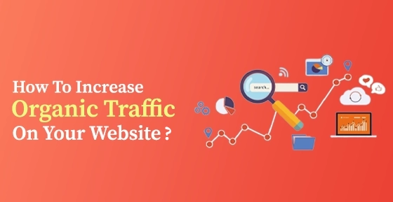
How To Increase Organic Traffic On Your Website?
Cotgin Analytics |30-Jul-2024
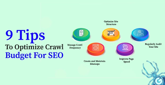
9 Tips To Optimize Crawl Budget For SEO
Cotgin Analytics |25-Jul-2024

Best Social Media Management Tools In 2024
Cotgin Analytics |23-Jul-2024

How To Write High-Quality Content in 2024
Cotgin Analytics |15-Jul-2024

8 Proven Strategies For Conversion Rate Optimization
Cotgin Analytics |04-Jul-2024

8 Effective Social Media Marketing Strategies For Business Growth
Cotgin Analytics |26-Jun-2024

The Best e-Commerce Market Places for Business - Leading Platforms
Cotgin Analytics |18-Jun-2024

The Future of Blockchain Technology in Digital Marketing
Cotgin Analytics |11-Jun-2024

Different Types of Featured Snippets - A Shortcut to the Top of Google
Cotgin Analytics |04-Jun-2024

Future of SEO: Expect from Google's AI Updates
Cotgin Analytics |28-May-2024

Exploring the Digital World - with the Help of Digital Marketing Strategy
Cotgin Analytics |21-May-2024

Instagram for Business - Grow Your Business and Drive Results
Cotgin Analytics |14-May-2024

Types of Mobile App Development Services - the Era of 5G
Cotgin Analytics |06-May-2024

Best AI Tools for Business Marketing and Success
Cotgin Analytics |29-Apr-2024

How To Increase Blog Engagement & Drive More Interaction?
Cotgin Analytics |08-Apr-2024
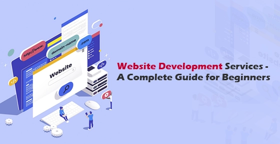
Website Development Services: A Comprehensive Guide
Cotgin Analytics |03-Apr-2024

7 Reasons Why Your Website Has A High Bounce Rate
Cotgin Analytics |01-Apr-2024

7 Ways To Increase Your Mobile App Downloads
Cotgin Analytics |28-Mar-2024

10 Email Marketing Strategies To Maximize Your Earnings In 2024
Cotgin Analytics |26-Mar-2024
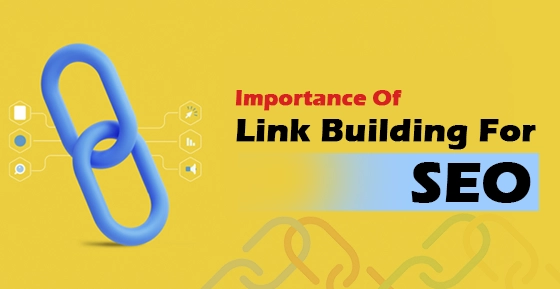
Importance of Link Building For the Success of your Website
Cotgin Analytics |22-Mar-2024

Useful ChatGPT Prompts To Create An Outstanding Mobile Application
Cotgin Analytics |21-Mar-2024
How To Increase Conversion Rate From Landing Page?
Cotgin Analytics |18-Mar-2024

What Digital Marketing Company Should Know About Google’s Core Updates 2024?
Cotgin Analytics |15-Mar-2024

What To Keep In Mind While Redesigning A Website?
Cotgin Analytics |12-Mar-2024

Top 8 Video Marketing Strategies To Grow Your Business
Cotgin Analytics |08-Mar-2024

Why Business Need Omnichannel Strategy?
Cotgin Analytics |06-Mar-2024

Mastering In LinkedIn Advertising :Tips to Targeting B2B Audiences
Cotgin Analytics |04-Mar-2024

Web Development Technologies To Use In 2024
Cotgin Analytics |01-Mar-2024

Best Content Marketing Trends You Need To Know In 2024
Cotgin Analytics |28-Feb-2024
Emerging Digital Marketing Trends You Must Know
Cotgin Analytics |26-Feb-2024

Top Technologies For Metaverse Development
Cotgin Analytics |23-Feb-2024

Features You Must Consider In ECommerce Website
Cotgin Analytics |21-Feb-2024

Best 10 SEO Tools to Improve Ranking
Cotgin Analytics |15-Feb-2024
How To Optimize Google My Business Profile To Accelerate Growth?
Cotgin Analytics |14-Feb-2024
How Is SEO Different From PPC?
Cotgin Analytics |01-Feb-2024

Which Is Better For Your Website Wordpress Or PHP?
Cotgin Analytics |19-Jan-2024
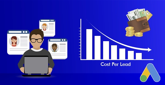
Best 9 Ways To Decrease Cost Per Leads In Google Ads Campaign
Cotgin Analytics |16-Jan-2024
Why Is E-Learning App Important For Education In 2024?
Cotgin Analytics |12-Jan-2024
How CRM Can Help Your Business To Boost Sales?
Cotgin Analytics |11-Jan-2024

How To Choose Ecommerce Website Design Company For Online Store?
Cotgin Analytics |03-Dec-2023

Top Reasons Why Your Business Needs SEO
Cotgin Analytics |05-Nov-2024

How To Use Google Shopping Ads Effectively To Boost Your Sales?
Cotgin Analytics |09-Dec-2024

Top Ways To Increase Your Mobile App Downloads
Cotgin Analytics |18-Dec-2024

Why Do Companies Spend On Advertising?
Cotgin Analytics |26-Dec-2024
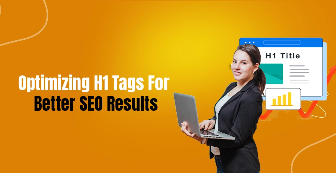
Optimizing H1 Tags For Better SEO Results
Cotgin Analytics |03-Jan-2025

Why Laravel Is The Key To Your Next Successful Web Project?
Cotgin Analytics |07-Jan-2025

Advantages Of WordPress Development In 2025
Cotgin Analytics |10-Jan-2025

What Is The Importance Of SEO For An E-commerce Website?
Cotgin Analytics |14-Jan-2025

What Is The Difference Between UI/UX Design And Web Design?
Cotgin Analytics |16-Jan-2025

Why Your Business Needs A Professional Logo Design?
Cotgin Analytics |20-Jan-2025

How To Become Great IN Content Writing?
Cotgin Analytics |23-Jan-2025

Digital Marketing Tips For Law Firms
Cotgin Analytics |29-Jan-2025

What Are The Benefits Of Laravel Development?
Cotgin Analytics |31-Jan-2025

Web Design Services: Your Gateway To Digital Success
Cotgin Analytics |04-Feb-2025

Transform Your Website With A Premier PHP Web Development Company In Delhi
Cotgin Analytics |07-Feb-2025

Top Google Ads Trends You Cannot Ignore In 2025
Cotgin Analytics |13-Feb-2025

What Is A Landing Page And How Would You Use It?
Cotgin Analytics |14-Feb-2025
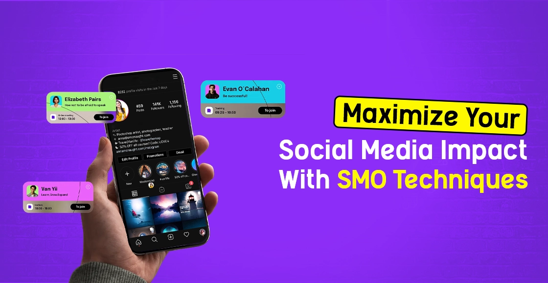
Maximize Your Social Media Impact With SMO Techniques
Cotgin Analytics |19-Feb-2025

Common Google Ads Mistakes And Process To Avoid Them
Cotgin Analytics |24-Feb-2025

How To Improve Website Performance?
Cotgin Analytics |27-Feb-2025

How Content Writing Services Can Transform Your Online Presence?
Cotgin Analytics |03-Mar-2025

What Is The Main Purpose Of Chatbot?
Cotgin Analytics |10-Mar-2025

What Is Organic Traffic? & How To Drive It To Your Website?
Cotgin Analytics |12-Mar-2025
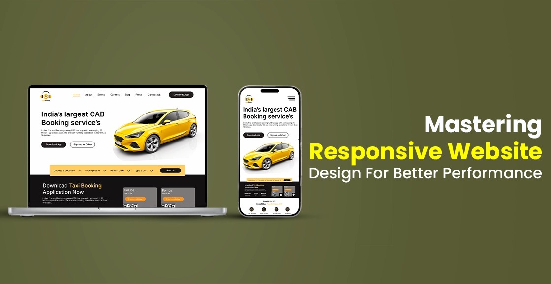
Mastering Responsive Website Design For Better Performance
Cotgin Analytics |17-Mar-2025

How A WordPress Development Agency Can Elevate Your Online Presence?
Cotgin Analytics |21-Mar-2025

Why Your Business Needs A UI/UX Design Agency In 2025?
Cotgin Analytics |24-Mar-2025

How An SEO Agency In Delhi Can Elevate Your Search Ranking?
Cotgin Analytics |27-Mar-2025

Innovative Logo Design Services In Delhi To Boost Your Business
Cotgin Analytics |31-Mar-2025

The Importance Of Regular Website Maintenance For Long-Term Growth
Cotgin Analytics |03-Apr-2025
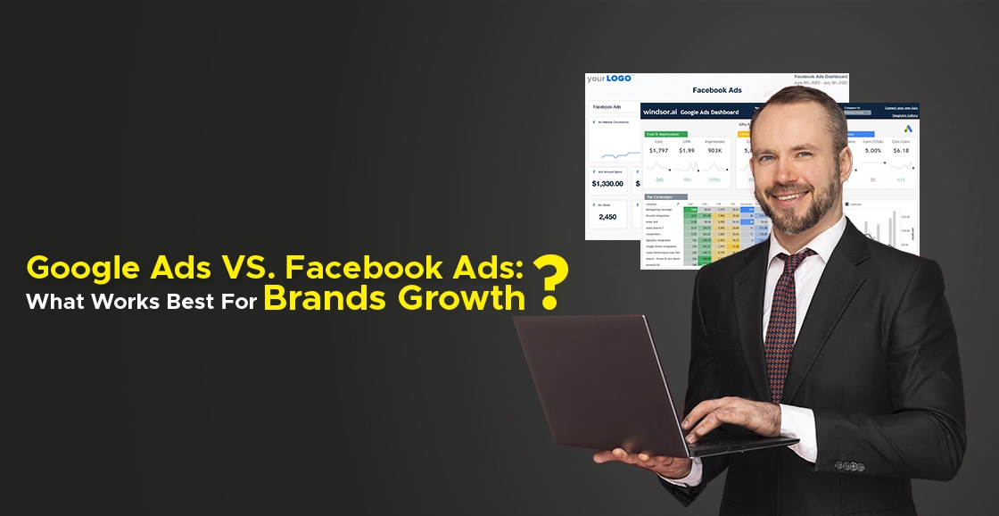
Google Ads vs. Facebook Ads: What Works Best For Brand Growth?
Cotgin Analytics |08-Apr-2025

Boost User Engagement With Dynamic Website Designing In 2025
Cotgin Analytics |11-Apr-2025

Mobile-Friendly E-commerce Design: Why It Matters More Than Ever?
Cotgin Analytics |15-Apr-2025

Future-Proof Your Business With A Website Development Agency
Cotgin Analytics |18-Apr-2025

Best Content Marketing Trends For 2025
Cotgin Analytics |22-Apr-2025

Best Features Offered By Website Development Companies In Noida
Cotgin Analytics |25-Apr-2025

How The Best SEO Company In Noida Can Grow Your Business?
Cotgin Analytics |29-Apr-2025

Power Up Your Website With Top SEO Experts In Defence Colony
Cotgin Analytics |02-May-2025

Difference Between Online Marketing & Offline Marketing
Cotgin Analytics |06-May-2025

The Role Of Graphic Design In Brand Success
Cotgin Analytics |09-May-2025

How Digital Marketing Helps Schools & Colleges Grow Online?
Cotgin Analytics |13-May-2025

Improve Your Hospital’s Online Presence With Smart SEO In 2025
Cotgin Analytics |16-May-2025